Assessment report design: 6 key tips to do it right for your consultancy or in your company

Imagine: You have created a questionnaire and you’re eager to send it out into the world. You want to give your respondents clear feedback and recommendations immediately after they’ve completed it. 

The best way to do so is by presenting them with a personalized report. But how do you design an attractive report? That’s what we’ll discuss in this article, showing 6 best practices that result in higher brand awareness and increased engagement with your company:

PS. These best practices can also be applied to other types of business reports

self assess final screen report

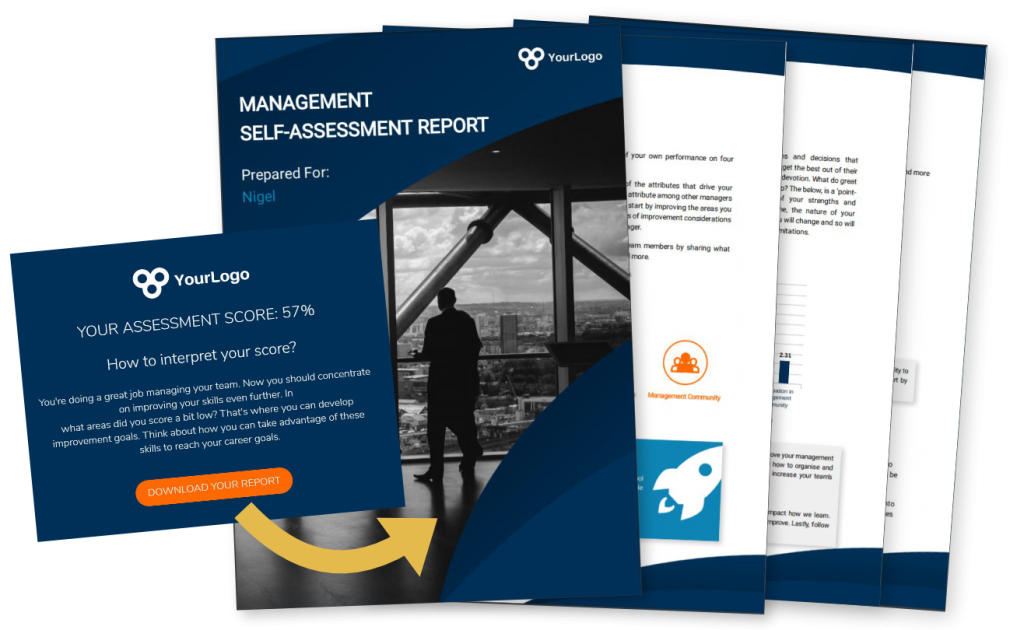
Report design tip #1: Use corporate branding to represent your company

You have the opportunity to connect with your audience and make sure they remember you. 

That’s why it’s important to build a good-looking, branded report, that stays true to your corporate identity. Moreover, when people read about themselves, they tend to be more interested. This means they’re always engaged just a little bit more. This is your opportunity to spotlight your brand.

You stay true to your corporate identity by following your brand style guidelines. This refers both to the visual guidelines, such as font, color pallet and logo, but also to your tone-of-voice, which can be commercial, informative, academic, etc.
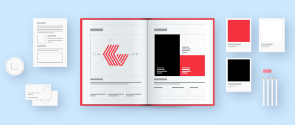
Report design example

Report tip #2: Personalize your report

A very simple but effective way to engage with your respondent: address him/her personally in the report. 

You can test this principle for yourself in real-life situations: aren’t you more involved in a conversation when someone says your name? You’ll automatically pay more attention as from that moment. 

While designing a report, you can already start with the main title, e.g. “Sofie’s Personal Skills Report”. Some other examples:
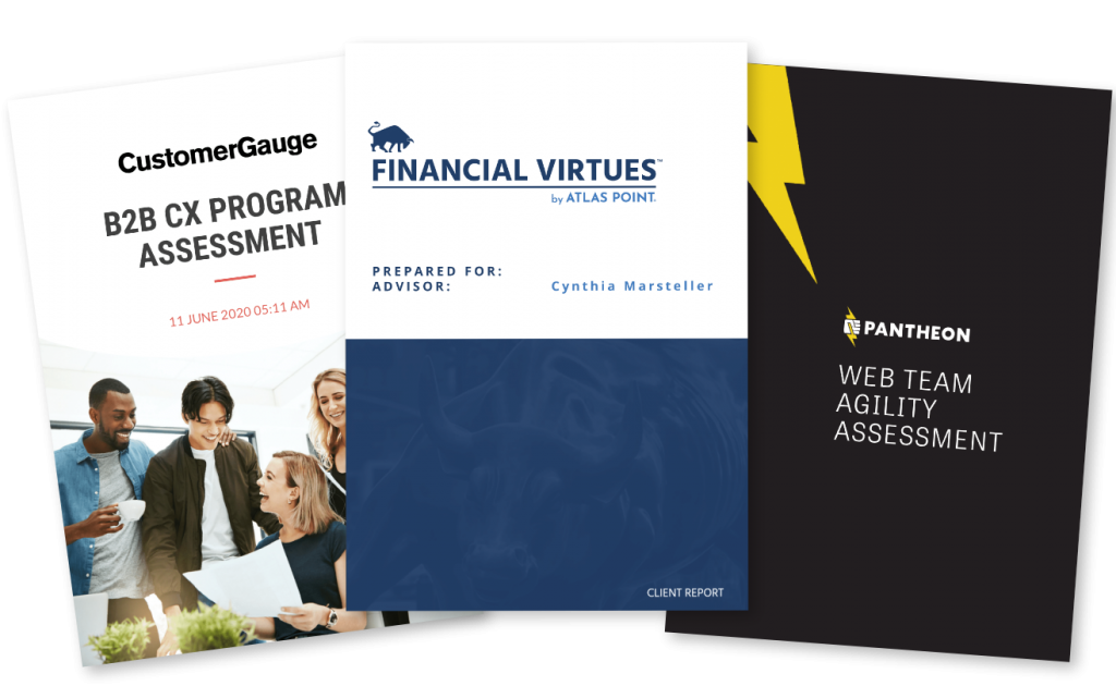
Report front page design examples

In order to make this possible, you’ll have to include variable content (name, scores, recommendations, …)  that enables you to address each different respondent that took the questionnaire. Not only on the first page, but also in the rest of the report. 

Talk to the reader, as if you were having a real-life conversation in which you explain what the findings of the test are.

Make personal recommendations: this motivates the reader to follow up on the report and reconsult it afterwards, or show it to colleagues or friends.
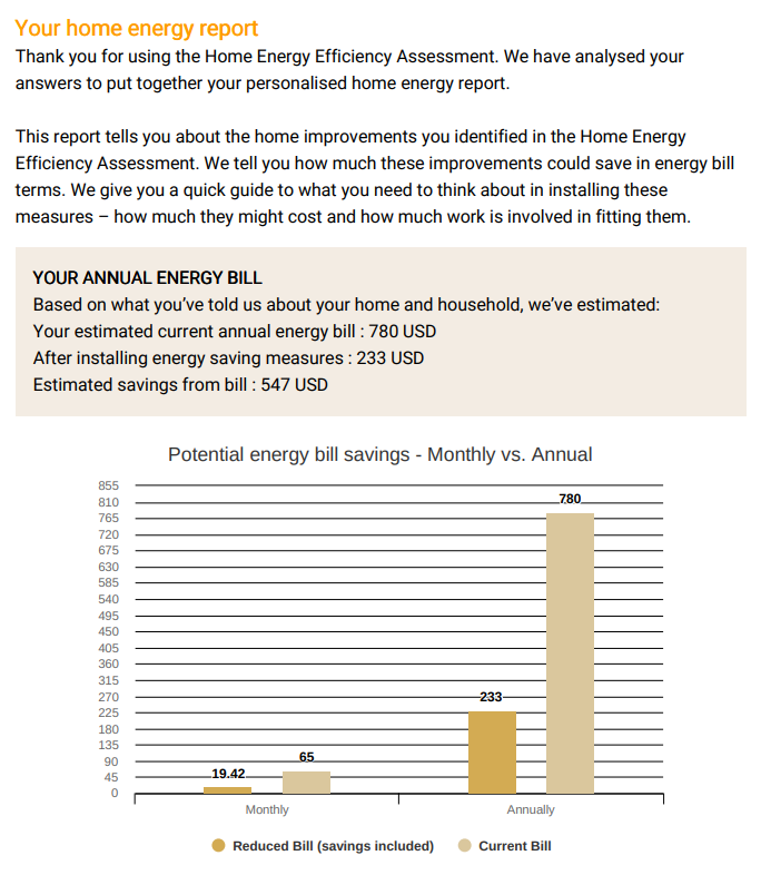
An assessment mockup template. Yet another way to improve your report design.
Questions or remarks?
Do you come across any input from me that you feel different about or that you feel is inaccurate? Don't hesitate to get in touch with me directly via LinkedIn. It wouldn't be the first time I've learned from such an exchange.

Report tip #3: Maintain your questionnaire style in your report design

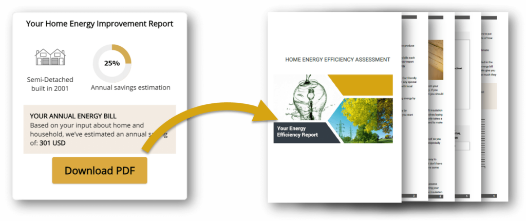
When you read a survey-based report, you expect this report to be in the same format as the survey. Every survey is built using a certain style, colour combination and font. If the report following that survey suddenly looks completely different, there is a high chance respondents will lose attention, because they don’t see a connection with the survey they just filled out. So maintaining the style of the survey is key.

Of course, you want your audience to have a pleasant experience reading about their personal results. It makes them connect with the subject, and even more so, with you. That’s why you need to keep them “in the zone” after they’ve finished the list of questions. 

Above, you can see an example of the last view you get after having taken this assessment. If you click the button “Download PDF”, you’ll get more details and recommendations for the future. As you can see, the same color pattern, font and style are maintained in both the survey as in the report. 

Report tip #4: Organize your report for readability

Make sure your report is pleasant to read and easy to interpret. In a world where time is precious, readers should be able to understand the assessment results in the blink of an eye. 

The structure of your report is paramount: don’t make it too text-heavy. Use titles, summaries, charts and images to point out the most important insights

A clear report design structure

Make sure you have a classification that makes sense to the respondent. Bring structure in your report: discuss the results and present recommendations grouped together under a clear categorization:

  • Create a clear structure by using headings and segment divisions. Preferably, every segment starts on a new page
  • Put the headings and charts in a theme color
  • Minimize dense walls of text: with more than 3-4 sentences of text you lose the attention of the reader
  • Highlight the most important facts. Use a terminology that is in balance with your theme and subject
  • If you’re not sure about a certain sentence, you can use an AI-powered tool to rewrite sentences
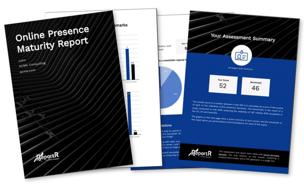
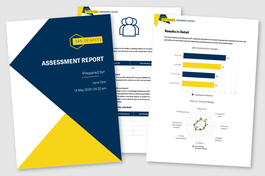
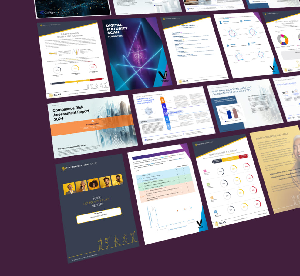
Maturity assessment report design example of multiple pages

Summaries

You can “pimp” bullet points in the theme color of your report. If your company logo allows it, you can even use your logo as a bullet point.

Charts and graphics

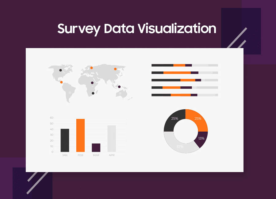
If you use bar- or pie charts, make sure they are presented in your theme color. The remaining colors should match your main color. Consult your corporate brand style guide to choose which colors match best and use professional graphic design software to maintain consistency across projects.
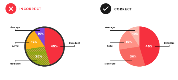
Pie chart designs as part of a report

Images

Make sure your images are absolutely relevant to the content. Avoid abstract visuals. It makes no sense to show a stock image of an office when you’re talking about energy efficiency. So choose wisely! Usually, the image that pops up in your mind spontaneously when thinking about a subject, will be the best visual.

If you understand what contrast is in photography, use this knowledge to make your subject stand out. This doesn’t necessarily mean using bright and bold colors, but it can include using contrasting elements like light and dark, warm and cool tones, or smooth and rough textures.
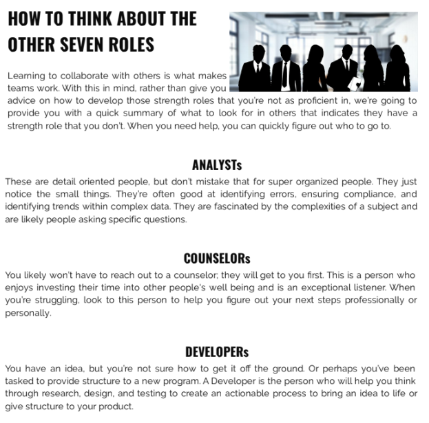
Use of images in report design illustrated

Make sure that the images in your report are not too large. Also here, you need to keep the text-visual balance in mind.

You can use a recurring header image, if the visual is simple and provides a sense of calmness, tranquility. Choose an image that complies easily with your brand style colors.

Wow prospects with Pointepro-built automated reports

Here’s a quick introduction on how Pointerpro works, brought to you by one of our product Experts, Chris.

This is what clients say about us:

Report design tip #5: Use design colors that win

The choice of colors influences the communication style of your report as well. 

Data is better retained when you apply vivid colors combined with high contrast. Your respondents will be able to digest the given information more easily when you combine a neutral color like black or grey with a bright color like red, blue, yellow or green to highlight titles, keywords or charts.

Associations are automatically made with certain colors. As already mentioned above, vivid colors get it done. They draw attention and keep the reader engaged. Each color represents different concepts or feelings:

The use of report design colors explained

Red: this color is immediately related with the connotations “wrong” or “incorrect”. In a report, red might therefore be conveyed to be a bad color choice. However, red doesn’t always have to be a bad idea! It can also be associated with action, passion or determination.

 Green: as opposed to red, green is often connected to positive growth or upward trends. Within a report, incorporating a green data point provides a trigger to evoke a positive experience.

 Blue: a lot of brands use blue as their main color. Look at social media brands like Facebook, Twitter and LinkedIn, or large enterprise brands Samsung, BMW and P&G. The colour blue reflects professionality and interaction, and is related to a high rating or performance. 

 Yellow: people tend to associate yellow with “okay” or “average”. It can also be related to happiness, a general good feeling. Because of the brightness of the color, yellow is also often associated with clarity and energy.

This is an interesting color guideline, but of course you need to consider your branding style and subject as well. You can also use variations of these colors, you don’t have to go for the brightest yellow or the “grassiest” green 😉 Just make sure your report is based on a theme color, and build the rest around it.

Report design tip #6: Find a balance between text and visuals

Clutter smothers, simplicity breathes: make the results of your questionnaire easy to digest. If there is too much text, people tend to start reading diagonally and miss out on interesting insights. Instead, look for a balance between visuals like charts, diagrams or helpful images. We’ve already mentioned above how to design charts and select images for reports. 

There is no fixed rule or formula to determine the amount of visuals that a report should contain. For each report you’ll apply a different ratio. 2021 represents a highly visual era, so make sure there is at least a 50/50 balance between text and visuals to grab the attention of your reader. If insights can be presented visually, seize the opportunity to create charts and diagrams.

In general, the visuals should sum up the details of the results, while a short piece of text can accompany the visual by listing out the major takeaways.

Optimal balance between text and visual in a report design

Don’t use words if the same information can be presented visually. If there are titles, text segments or keywords that are essential to your report, you can underline them in a brand style color. 

Spider chart example

How to do more with your reports

Before you design a survey report you’ll need to keep a blueprint in mind. A blueprint of how the report can reflect your company – both value-wise as aesthetically – and a tone-of-voice with which you’ll address your respondents.  You’ve probably already done that when you designed the questionnaire, and will continue to follow these outlines.

Personalization plays an important role in building your report. Moreover, if you personalize your report, it can become a real conversation-maker between colleagues, fellow students… In a good report, insights and recommendations will be better retained and applied more easily.  

Try using a tool like Pointerpro to deliver personalized pdf reports.

And last but not least, a standard requirement for every report should be the readability and interpretability. A qualitative balance between text and visuals makes that possible. Speak about results and insights through visualization. Personalization, structure and interpretability: when you’ve got these 3 criteria straight, you have a strong report!

Need to prepare a report for a client? 

Read our article: How digital agencies should use client reports to prove value


Imagine: You have created a questionnaire and you’re eager to send it out into the world. You want to give your respondents clear feedback and recommendations immediately after they’ve completed it. 

The best way to do so is by presenting them with a personalized report. But how do you design an attractive report? That’s what we’ll discuss in this article, showing 6 best practices that result in higher brand awareness and increased engagement with your company:

PS. These best practices can also be applied to other types of business reports

self assess final screen report

Report design tip #1: Use corporate branding to represent your company

You have the opportunity to connect with your audience and make sure they remember you. 

That’s why it’s important to build a good-looking, branded report, that stays true to your corporate identity. Moreover, when people read about themselves, they tend to be more interested. This means they’re always engaged just a little bit more. This is your opportunity to spotlight your brand.

You stay true to your corporate identity by following your brand style guidelines. This refers both to the visual guidelines, such as font, color pallet and logo, but also to your tone-of-voice, which can be commercial, informative, academic, etc.

Report design example

Report tip #2: Personalize your report

A very simple but effective way to engage with your respondent: address him/her personally in the report. 

You can test this principle for yourself in real-life situations: aren’t you more involved in a conversation when someone says your name? You’ll automatically pay more attention as from that moment. 

While designing a report, you can already start with the main title, e.g. “Sofie’s Personal Skills Report”. Some other examples:

Report front page design examples

In order to make this possible, you’ll have to include variable content (name, scores, recommendations, …)  that enables you to address each different respondent that took the questionnaire. Not only on the first page, but also in the rest of the report. 

Talk to the reader, as if you were having a real-life conversation in which you explain what the findings of the test are.

Make personal recommendations: this motivates the reader to follow up on the report and reconsult it afterwards, or show it to colleagues or friends.

An assessment mockup template. Yet another way to improve your report design.
Questions or remarks?
Do you come across any input from me that you feel different about or that you feel is inaccurate? Don't hesitate to get in touch with me directly via LinkedIn. It wouldn't be the first time I've learned from such an exchange.

Report tip #3: Maintain your questionnaire style in your report design

When you read a survey-based report, you expect this report to be in the same format as the survey. Every survey is built using a certain style, colour combination and font. If the report following that survey suddenly looks completely different, there is a high chance respondents will lose attention, because they don’t see a connection with the survey they just filled out. So maintaining the style of the survey is key.

Of course, you want your audience to have a pleasant experience reading about their personal results. It makes them connect with the subject, and even more so, with you. That’s why you need to keep them “in the zone” after they’ve finished the list of questions. 

Above, you can see an example of the last view you get after having taken this assessment. If you click the button “Download PDF”, you’ll get more details and recommendations for the future. As you can see, the same color pattern, font and style are maintained in both the survey as in the report. 

Report tip #4: Organize your report for readability

Make sure your report is pleasant to read and easy to interpret. In a world where time is precious, readers should be able to understand the assessment results in the blink of an eye. 

The structure of your report is paramount: don’t make it too text-heavy. Use titles, summaries, charts and images to point out the most important insights

A clear report design structure

Make sure you have a classification that makes sense to the respondent. Bring structure in your report: discuss the results and present recommendations grouped together under a clear categorization:

  • Create a clear structure by using headings and segment divisions. Preferably, every segment starts on a new page
  • Put the headings and charts in a theme color
  • Minimize dense walls of text: with more than 3-4 sentences of text you lose the attention of the reader
  • Highlight the most important facts. Use a terminology that is in balance with your theme and subject
  • If you’re not sure about a certain sentence, you can use an AI-powered tool to rewrite sentences
Maturity assessment report design example of multiple pages

Summaries

You can “pimp” bullet points in the theme color of your report. If your company logo allows it, you can even use your logo as a bullet point.

Charts and graphics

If you use bar- or pie charts, make sure they are presented in your theme color. The remaining colors should match your main color. Consult your corporate brand style guide to choose which colors match best and use professional graphic design software to maintain consistency across projects.

Pie chart designs as part of a report

Images

Make sure your images are absolutely relevant to the content. Avoid abstract visuals. It makes no sense to show a stock image of an office when you’re talking about energy efficiency. So choose wisely! Usually, the image that pops up in your mind spontaneously when thinking about a subject, will be the best visual.

If you understand what contrast is in photography, use this knowledge to make your subject stand out. This doesn’t necessarily mean using bright and bold colors, but it can include using contrasting elements like light and dark, warm and cool tones, or smooth and rough textures.

Use of images in report design illustrated

Make sure that the images in your report are not too large. Also here, you need to keep the text-visual balance in mind.

You can use a recurring header image, if the visual is simple and provides a sense of calmness, tranquility. Choose an image that complies easily with your brand style colors.

Wow prospects with Pointepro-built automated reports

Here’s a quick introduction on how Pointerpro works, brought to you by one of our product Experts, Chris.

This is what clients say about us:

Report design tip #5: Use design colors that win

The choice of colors influences the communication style of your report as well. 

Data is better retained when you apply vivid colors combined with high contrast. Your respondents will be able to digest the given information more easily when you combine a neutral color like black or grey with a bright color like red, blue, yellow or green to highlight titles, keywords or charts.

Associations are automatically made with certain colors. As already mentioned above, vivid colors get it done. They draw attention and keep the reader engaged. Each color represents different concepts or feelings:
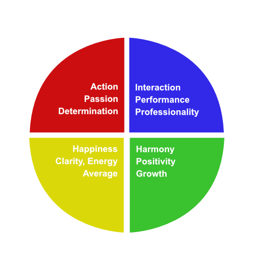
The use of report design colors explained

Red: this color is immediately related with the connotations “wrong” or “incorrect”. In a report, red might therefore be conveyed to be a bad color choice. However, red doesn’t always have to be a bad idea! It can also be associated with action, passion or determination.

 Green: as opposed to red, green is often connected to positive growth or upward trends. Within a report, incorporating a green data point provides a trigger to evoke a positive experience.

 Blue: a lot of brands use blue as their main color. Look at social media brands like Facebook, Twitter and LinkedIn, or large enterprise brands Samsung, BMW and P&G. The colour blue reflects professionality and interaction, and is related to a high rating or performance. 

 Yellow: people tend to associate yellow with “okay” or “average”. It can also be related to happiness, a general good feeling. Because of the brightness of the color, yellow is also often associated with clarity and energy.

This is an interesting color guideline, but of course you need to consider your branding style and subject as well. You can also use variations of these colors, you don’t have to go for the brightest yellow or the “grassiest” green 😉 Just make sure your report is based on a theme color, and build the rest around it.

Report design tip #6: Find a balance between text and visuals

Clutter smothers, simplicity breathes: make the results of your questionnaire easy to digest. If there is too much text, people tend to start reading diagonally and miss out on interesting insights. Instead, look for a balance between visuals like charts, diagrams or helpful images. We’ve already mentioned above how to design charts and select images for reports. 

There is no fixed rule or formula to determine the amount of visuals that a report should contain. For each report you’ll apply a different ratio. 2021 represents a highly visual era, so make sure there is at least a 50/50 balance between text and visuals to grab the attention of your reader. If insights can be presented visually, seize the opportunity to create charts and diagrams.

In general, the visuals should sum up the details of the results, while a short piece of text can accompany the visual by listing out the major takeaways.
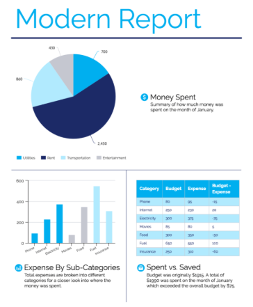
Optimal balance between text and visual in a report design

Don’t use words if the same information can be presented visually. If there are titles, text segments or keywords that are essential to your report, you can underline them in a brand style color. 
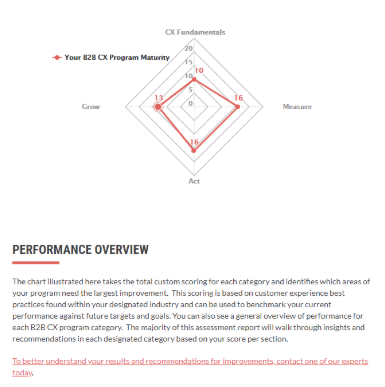
Spider chart example

How to do more with your reports

Before you design a survey report you’ll need to keep a blueprint in mind. A blueprint of how the report can reflect your company – both value-wise as aesthetically – and a tone-of-voice with which you’ll address your respondents.  You’ve probably already done that when you designed the questionnaire, and will continue to follow these outlines.

Personalization plays an important role in building your report. Moreover, if you personalize your report, it can become a real conversation-maker between colleagues, fellow students… In a good report, insights and recommendations will be better retained and applied more easily.  

Try using a tool like Pointerpro to deliver personalized pdf reports.

And last but not least, a standard requirement for every report should be the readability and interpretability. A qualitative balance between text and visuals makes that possible. Speak about results and insights through visualization. Personalization, structure and interpretability: when you’ve got these 3 criteria straight, you have a strong report!

Need to prepare a report for a client? 

Read our article: How digital agencies should use client reports to prove value


Create your
own assessment
for free!

Create your
own assessment
for free!

About the author:
Iris De Geest

Iris De Geest

Iris De Geest runs digital PR at Pointerpro and is responsible for content and partnerships. She loves to create actionable content that helps businesses innovate and scale.
Want to know more?
Subscribe to our newsletter and get hand-picked articles directly to your inbox