In some ways, an assessment process is a lot like mining. The deeper you dig, the higher the chances of finding things of value. But also, the more effort you’ll need to put into cutting and polishing them into useful and visually attractive assessment reports.
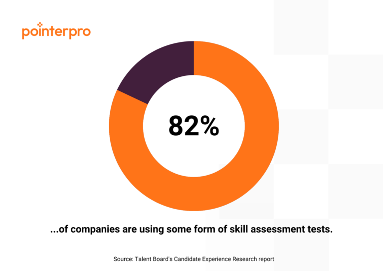
Even before the 2020 pandemic, more than 80% of companies reported having used some form of skills assessment. With remote work as a new standard, one can only imagine digital assessments becoming more prevalent and essential for HR departments and agencies. But how do you polish it into a good-looking, informative report that respondents can use to take action? Let’s dig into a few best practice examples together:
- Team assessment report example
- Financial advice report example
- DISC assessment report example
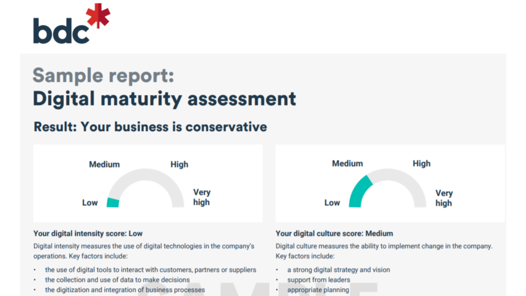
- Digital maturity assessment report example
Psst! Want to dive straight into step-by-step tips on how to build your assessment reports? Then click here.
Just so we’re aligned: What is an assessment report?
An assessment evaluates a person or an organization using a series of questions. The answers are used to calculate a score, categorization or another type of outcome that provides value for the respondent.
There are many types of assessments, categorized by industry, objectives, methodology, etc. In this article we’ll be focusing solely on assessment reports, if you’re looking to find the best assessment tool, I highly recommend our guide to select the right assessment tool for your business.
An assessment report will give respondents clear insights into their profile, company, or situation and provide relevant recommendations. And you know what the good news is? The creation of an assessment report can be automated.
How? Well, in a nutshell: Thanks to formulas and calculations behind the preset questions in the assessment. They turn the answers into tangible results, presented in the assessment report in the form of text, numbers, graphs, charts and other representations.
![]()
Let’s say you are a marketing consultant asking your client about their current marketing strategy. What are their objectives? Which marketing tools do they currently use? How much do they want to spend on marketing activities such as ads?
Based on their answers, you’ll get a first glance at their situation and be able to map out a strategy that you can present to them by showing them a personalized report, as if it were created especially for them.
Examples of assessment reports
I’ll give you real-life examples to help you get the most out of your assessment report. I will rate every report example in terms of several criteria. Use this checklist to determine for yourself which report suits your purposes best.
Assessment report criteria checklist:


Questions or remarks?
Do you come across any input from me that you feel different about or that you feel is inaccurate? Don’t hesitate to get in touch with me directly via LinkedIn. It wouldn’t be the first time I’ve learned from such an exchange.

🟠 Readability: The balance between text and visuals on the first pages leans towards text heaviness. Images, graphics and examples could bring solace to the reader.
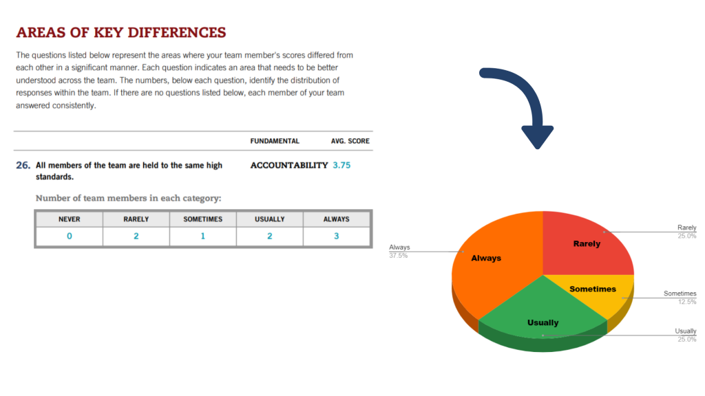
The same problem occurs later on in the report, where the results are discussed in more detail. It would be more illustrative to the reader if the variables in the result tables are presented in the form of charts. This improves the comparability of the different areas.
For example, the table “Areas of Key Differences” could be accompanied by a pie chart. These charts are used to represent the composition of an entity or group—in this case, the team and the different answers of the team members.


🟠 Introduction: The report jumps right into the insights, without telling you what you may expect as a reader or giving an overview of the possible outcomes. This is not a problem for the advisor, who should know the content of the report, but the client might be interested to read what they may expect to learn throughout the report.
Note: Atlas Point has addressed this concern by providing general information inline, which makes up for it largely.


Questions or remarks?
Do you come across any input from me that you feel different about or that you feel is inaccurate? Don’t hesitate to get in touch with me directly via LinkedIn. It wouldn’t be the first time I’ve learned from such an exchange.


Wow prospects with Pointepro-built automated reports
Here’s a quick introduction on how Pointerpro works, brought to you by myself.
“We use Pointerpro for all types of surveys and assessments across our global business, and employees love its ease of use and flexible reporting.”

Director at Alere
“I give the new report builder 5 stars for its easy of use. Anyone without coding experience can start creating automated personalized reports quickly.”

CFO & COO at Egg Science
“You guys have done a great job making this as easy to use as possible and still robust in functionality.”

Account Director at Reed Talent Solutions
“It’s a great advantage to have formulas and the possibility for a really thorough analysis. There are hundreds of formulas, but the customer only sees the easy-to-read report. If you’re looking for something like that, it’s really nice to work with Pointerpro.”

Country Manager Netherlands at Better Minds at Work
There are many factors that determine the quality of an assessment report. If I did have to highlight what many agencies or organizations tend to look over, I’d mention these two:
- Personalize your assessment report: Use the name of your respondent throughout the report. You can do that in the header, footer, in text-based blocks, or in chart titles. Include personalized feedback per aspect you’re discussing.
- Make your assessment report visual: Balance out text and visuals. Why explain results in text-form when you can present them in easy-to-digest charts or tables? Don’t forget your design: take your corporate identity into account, use your house font and colors.
It’s important to note that there is not one “ideal model” that can be applied to every assessment report. If you’re planning on developing your own assessment reports and haven’t decided on a tool yet, be sure to give Pointerpro a try.
If you’re interested in auto-generating, assessment reports that are personalized, well-designed and branded, we’ll happily get in touch to get you started.
Want to know more?
Subscribe to our newsletter and get hand-picked articles directly to your inbox


About the author:
Ine Wouters
Ine is a passionate marketer with a passion for branding and strategy. She likes a no-nonsense approach with an eye for creativity in combination with reaching goals.