How to create a survey results report in 5 simple steps

Survey feedback can be hugely useful to businesses. After all, we need to know what it is we’re doing right and what we’re doing wrong so that we can do more of the former and less of the latter. Of course, there are various ways we can seek input from consumers. 

You could, for instance, try using a social media management tool to help you keep tabs on brand sentiment. Alternatively, you could consider checking product reviews on B2B ecommerce platforms to see what clients think. But it’s not just customers from whom we might want to seek feedback. Monitoring internal workplace sentiment is also crucially important, for example, to help improve productivity.

Whether you’re selling contact centre technology or a team collaboration tool, you have to work out what people make of it and whether it really serves the desired purpose. Put yourself in the shoes of a prospective client. You can guarantee they’ll be doing background research before committing themselves to any purchase. 

Surveys can help you get the inside track on what both your customers and employees feel about what you’re doing, and whether or not they think it’s fit for purpose. This can offer you unique insights while giving people an alternative outlet to leaving customer reviews (particularly useful if they’ve had negative experiences).
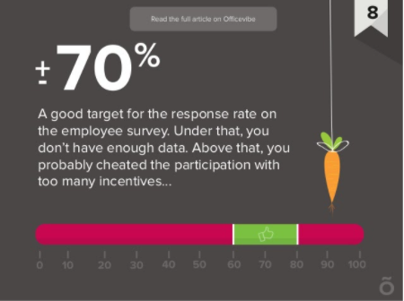
It’s all very well sending a survey out and encouraging people to fill it in. However, it also needs to provide a suitable basis for a survey results report upon which you can take concrete actions in response. Don’t overwhelm yourself with survey data that’s either unenlightening or simply irrelevant to what you’re hoping to achieve. You need to have a clear idea of how to present your results once you have them. The point of survey reporting is to present key insights in a crisp, clear and easily comprehensible way. 

So, what do you want people to take away from your survey, and how does that then lead to meaningful action? This is how you can go about improving your products and services. That’s whether you’re a B2C retailer or are selling a VoIP phone service to B2B clients. Here, we’ll list five simple and straightforward steps to creating an actionable survey report.

Creating a survey results report

1. Plan your survey before it’s sent out

To be effective, surveys have to have a clear purpose from the very outset. There needs to be a coherent plan underpinning your survey if it’s to bring back the kind of data you can act upon. Remember the point we’ve just discussed: you could quite easily end up with a deluge of data which you then find you can’t make effective use of. 

If this happens to you, it’s probably an indication that your survey itself is flawed. Avoiding this problem is a matter of asking the right questions so that your respondents give you the kind of information you need.
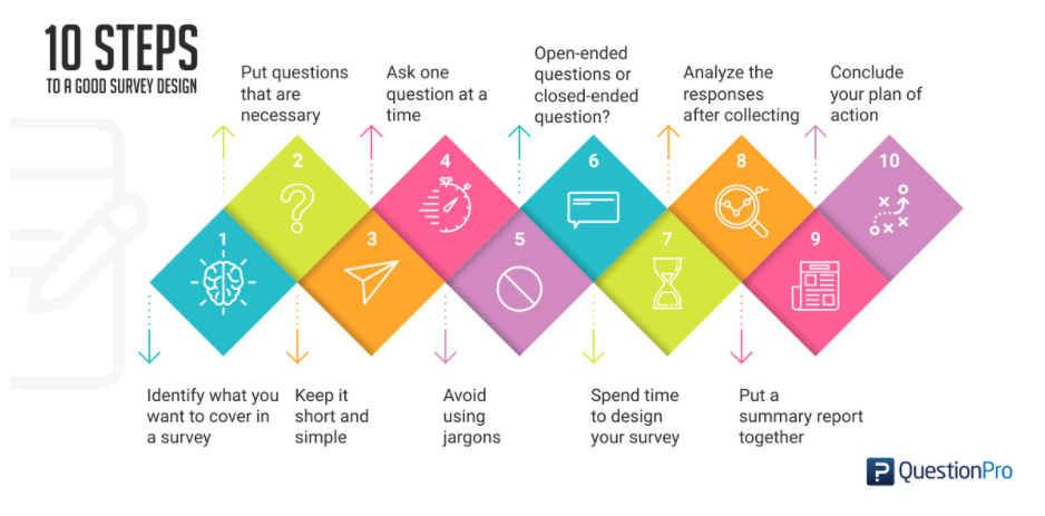

Prior to sending out your survey, take the time to plan it carefully. First, consider what your focus is. What are you hoping to achieve, and what information are you looking to obtain from respondents to reach your goal? 

Then, once you have that in mind, start to craft your questions. They must provide your team with the kind of details they’re likely to find useful, which is why they need to be as precisely worded as possible. This should help to minimise unwanted information, a perennial problem which can distort or confuse survey findings.

2. Segment your results

Following on from our earlier point about the potential for survey data to be overwhelming, you should also think about how to present that data once you have it. Your employees don’t have time to sift through reams of raw data to find information that might help them. Your results report, therefore, needs to do this part of the work for them. It must organise and present the information that’s most relevant to your employees in a way that helps them take away whatever insights they need from it.

Segmenting results is a really good way of presenting them so that people can see only the info most relevant to them. It provides a more granular view, allowing your team to gain in-depth insights from the survey data you’ve gathered. That’s without forcing them to delve deep into all the data for themselves – a process which is time-consuming, and for which your busy colleagues probably don’t have time.

3. Visualise your data

The unfortunate reality is that a lot of people who read your survey report will simply skim it. Of course, some people can be a little bit reluctant to accept this. Especially those who spent so much time gathering data, analysing it, condensing it into key points and then presenting it in the form of the report. Nevertheless, it is true. 

The vital thing here is to ensure that even those people who skim the report—because after all, your colleagues have lots of other things to keep them busy!—can still take those key points on board.

According to the University of Alabama School of Medicine, 65% of the US population are visual learners. Their study shows that colors, images, and other visual elements help a majority of the population with processing, organizing, and learning information.


So if you want your market research to get in front of more people, capitalize on creating visuals like infographics to accompany your survey results.

To show you just how powerful infographics are and how it can be extremely helpful in getting you more likes, shares, comments (and media attention), take a look at the following infographic from a research conducted by Market Domination Media.
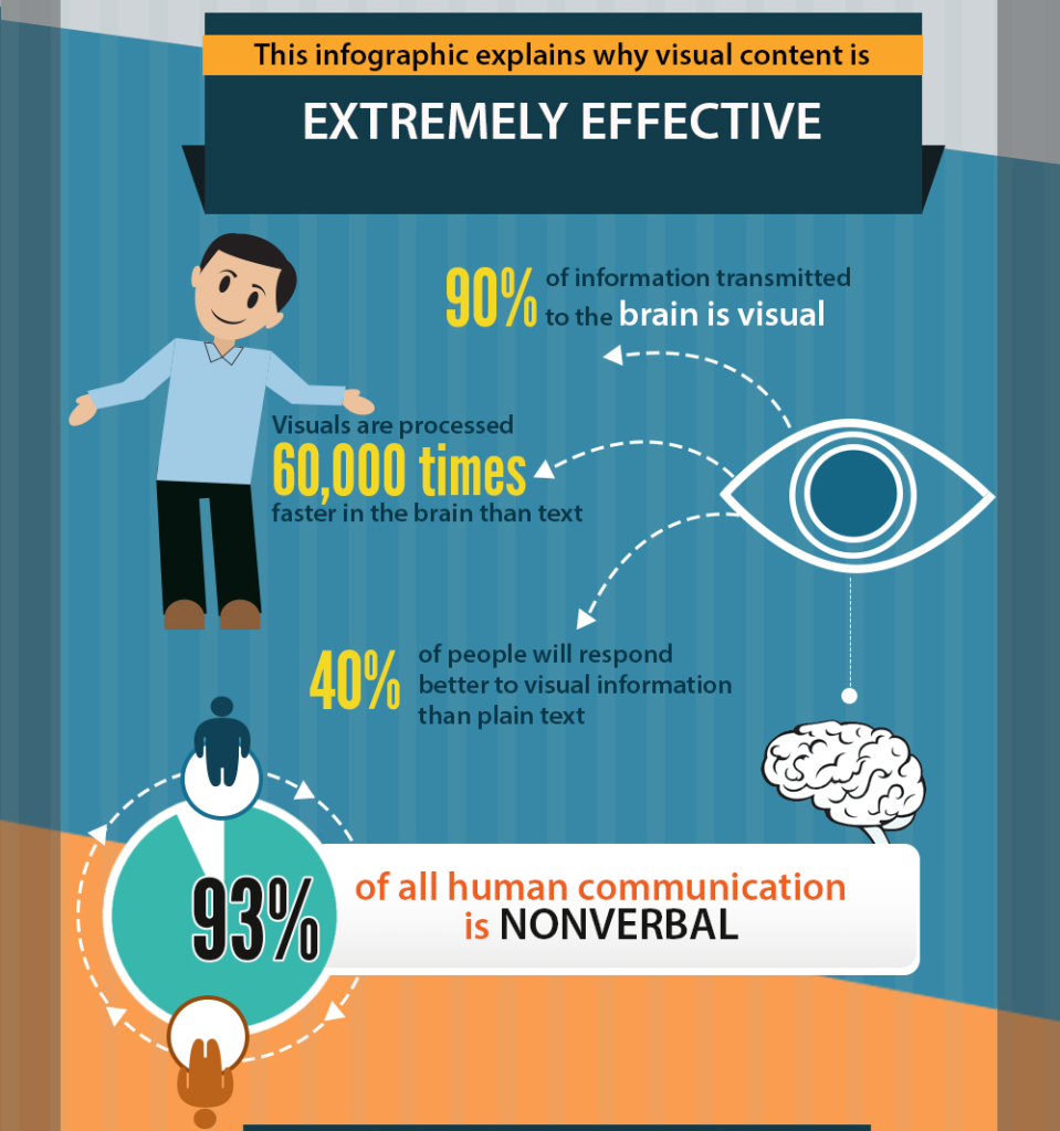

Infographics make scary numbers reader-friendly
 and easier to digest so people will be more likely to read your content, instead of feeding them a lengthy discussion of your research analysis that most people probably won’t have the time or attention span to read.

4. Present insights and not data

It should go without saying that data is incredibly important. If it wasn’t, we wouldn’t devote so much time and effort to gathering it through surveys. Data alone, though, isn’t going to help convey the kind of messages you need people to take away from your report. For that, it’ll also need context. 

It’s one thing to say, for example, that your survey indicates incentive marketing might boost sales by a certain percentage. But the trouble is that when statements of this sort are presented on their own, they don’t often tell us a great deal.

This is why you need to present context and a succinct explanation of the insight you’re trying to convey. Draw on the data but also elaborate upon it. Remember that the people who are reading your report aren’t all that concerned with the numbers on their own. Data is less interesting than the insights which are obtained from it. 

Your insights should be the main focus of your report. Of course, they need to be properly grounded in the data, but remember you only have a limited window to get your points across. Attention-grabbing headlines are a better way of doing that than numbers.

5. Encourage communication

Good communication is the foundation of effective teamwork, whichever profession or industry you’re in. The purpose of your survey results report is to lay the foundations for future action, and to provide well-informed guidance. The foundations are all it can establish, though. 

To get beyond this, and successfully implement a strategy based on your findings, you’ll need to ensure that the entire team is involved. Implementing a plan for action is unavoidably a collective effort.
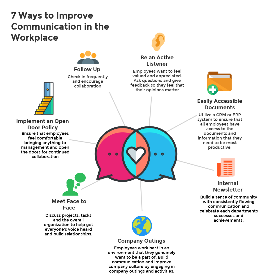
Your colleagues, therefore, need to understand that responsibility for implementing the next steps is as much theirs as it is yours. Your report should provide them with a great springboard, but they must appreciate that it’s up to them to build on it. 

A culture of close teamwork and open communication can go a long way to making this a reality. Colleagues should feel confident that they’re trusted to translate your recommendations into concrete change. In order to do so, they’ll need the freedom to raise any relevant issues about those recommendations freely.

Conclusion

Hopefully this post has made a few things clear. Above all, surveys will only prove to be effective insofar as they’re well planned, and the information they generate is communicated in the right way. Again, relatively few people will have the time and opportunity to sift through your results report with a fine tooth comb—so don’t expect it of them. Meet them halfway by making the information contained in the report as accessible, direct and engaging as possible. 

Make your report concise and visually attractive (though obviously, not at the expense of genuine substance). Furthermore, your colleagues should appreciate that your survey results report is unavoidably a work in progress. It’s one stage in the process, and its findings shouldn’t be treated as if they were absolute, unshakeable, gospel truth. People are complex, and they behave in complex ways – they might say one thing in a survey, only for their subsequent conduct and preferences to appear at odds with it. 

The insights your report provides are a snapshot of the opinions of a select group at one moment in time. They might well be very useful insights into the customer experience or employee wellbeing, but they can do no more than sketch a rough outline. It’s up to you and your colleagues to put real meat on the bones. 

For more tips on report design, read our 6 Best Practices for designing a report.

Create your
own assessment
for free!

Create your
own assessment
for free!

About the author:

Recommended reading

Want to know more?
Subscribe to our newsletter and get hand-picked articles directly to your inbox