As an expert in the information you’re presenting, you have to find a way to support your message in an entertaining way.
Don’t treat your presentation as a data dump.
Transform your content to be captivating. You may be tempted to cram as much information as possible into your presentation. But, that will be too overwhelming for your audience. Present your data in a way that pulls your audience in while achieving your business goals at the same time.
When you have the advantage of perfectly responsive design for your data, your presentation will go much smoother. Not only will your audience be impressed, but they will also be pulled in by your message. The rest of your presentation has to be equally as impressive. Here are a few easy to follow tips on how you can craft a compelling survey results presentation.
1. Know your audience
Your audience should be a top priority, even before anything has been designed. You need to know who they are, the reason they’re there, and how you can help them. When you do your research on how to properly speak to a particular crowd, it’s much easier to build a connection and receive your desired response. Turn your audience into brand advocates.
Prior to your presentation date, speak to the organizer of the event or meeting to learn about the demographic and background of the audience. Also, ask for their level of knowledge on the topic you’re about to speak on. You want to present new data on your topic rather than reiterating what they already know.

But templates can be more affordable and save you time. If you decide to use them, choose high-quality PowerPoint templates from specialized providers such as TemplateMonster, Storydoc or Venngage. You’ll have the freedom to use pre-designed slides that still allow you to be creative. From monthly reports to big business presentations – it there is usually something for everyone!
The best option would be to get a professional to design your presentation for you. They know exactly what you should and should not include in your slides. Hire an agency or a graphic design service that will walk through every slide of your presentation with you.
Not only will they take the time to understand your brand, but you know you’re going to get a custom product that will speak volumes.

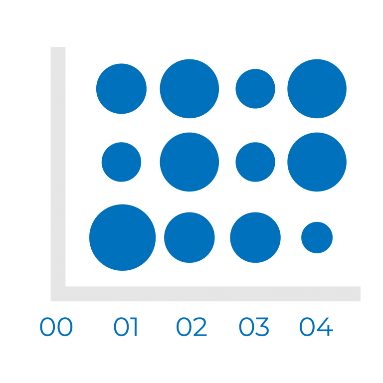
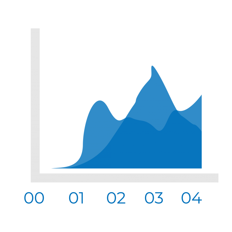
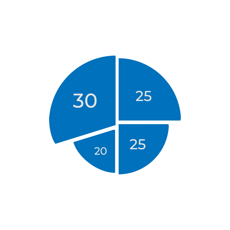
Choosing the wrong way to present your data will result in a misinterpretation of the data. Are you trying to compare values or analyze a trend? What is the best way to visualize and present that data? Use the best chart or table to display that will keep your audience’s focus. Here are a few examples of data visualization that will help present information in a way that is easy to understand.
General Examples of Data Visualization:
- Charts

- Tables

Graphs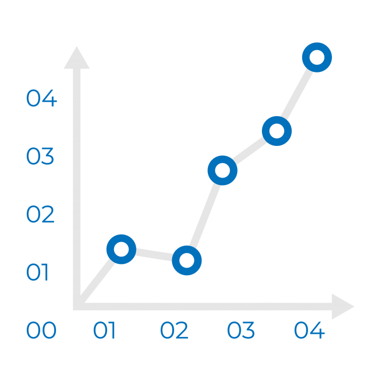
Maps
Infographics
Dashboards
Specific Examples of Data Visualization:
- Area Chart

- Bar Chart

- Box-and-whisker Plots

- Bubble Cloud

- Bullet Graph

- Cartogram

- Circle View
- Dot Distribution Map
- Gantt Chart

- Heat Map
- Highlight Table

- Histogram

- Matrix

- Network

- Polar Area

- Radial Tree

- Scatter Plot (2D or 3D)

- Streamgraph
- Text Tables

- Timeline

- Treemap

- Wedge Stack Graph
- Word Cloud

As you can see, there are many ways to present your data. Bar and pie graphs are only the tip of the iceberg. But, remember that not every chart or graph is right for the data that you’re trying to visualize. So choose the best type of graph that fits the information you’re presenting in a way your audience will understand.
When it comes to data, choose fonts that are easy to read and are big enough for your audience to see. Also, avoid using all caps, otherwise it will be hard to read.
Once you choose a readable font, stay consistent with each slide. Size your fonts according to the hierarchy.
This is a title
This is a subtitle
This is the description of scripts and values
There are tons of fonts out there to choose from. But, only a few are good for presentations.
Stick to fonts that are known for their browser compatibility like Verdana, Garamond, Arial, Helvetica, and Times New Roman, because data visualizations are commonly hosted on company sites or portals that must be viewed in a web browser. These are commonly used fonts that are the default in everyday browsers. Use the fonts listed for compatibility over multiple computers.
The way you present your data is imperative to achieving your business goals. Different rules apply in different contexts so display your data in a way that will help your audience understand your point. Make the right design choices, because your slides will only be up for a few seconds. Help your audience process the information quickly.
When choosing your chart, focus on what you want to emphasize. Ensure that your audience is following your train of thought and focusing on the right elements. Your slides will be impressive and memorable. So though data may sometimes be hard to grasp, by following these tips you’ll be able to simplify it into a meaningful presentation.


Want to know more?
Subscribe to our newsletter and get hand-picked articles directly to your inbox
About the author:
Jie Kuang
Jie is a Digital Marketer in Philadelphia, and Marketing Manager and Content Writer for Penji. She has grown the digital presence for multiple startups, building their online reputation and connecting them with their target audience. With her background in design, technology, and innovation strategy, she is focused on helping entrepreneurs succeed.