17 Bad survey questions and survey design mistakes

Writing a survey is one of the best ways to get information on your customers and your target market.  Whether you’re trying to figure out the best way to sell your next product or service or looking for ways on how to improve your existing experience, a quick survey is all you need.

To help you create the perfect survey questions, here are 17 of the most common mistakes when creating surveys that you need to avoid!

In this article:

17 Examples of bad survey questions and survey design mistakes

Bad survey questions

Survey design mistakes

Examples of bad survey questions

1. Questions with no audience target

Before you can get the information you want from surveying your audience, you need a basic understanding of who they are and what they need. How are you supposed to write a survey if you don’t know who it’s for?

Conduct research to make sure you understand what kind of language your audience will respond to, what method of communication they prefer, and what their basic demographics are.  

2. Questions with too few options

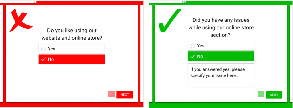
Following the consideration above, you need to provide a variety of answer options to give your customers. Many survey questions about your experience may be ‘yes’ or ‘no’ answers, but in some cases, and for more accurate results, ask respondents to elaborate on some of them.

For example:

Note: If the objective of your survey is to measure their maturity or performance in a specific domain, you should avoid open answers to elaborate on your questions.

Why? Because these answers are difficult to quantify. Rather define multiple answer options for your questions and attribute a score to each.To learn more about it, check out our blog article about how to develop a quantitative maturity model.


3. Questions that aren’t optimized for mobile

Creating a high-quality survey is essential for the return from your customers. If your customers are using a mobile device and they have to keep zooming in and out to answer questions properly, they’re going to have a bad experience, and they won’t fill it out and complete it.

Instead of spending your time trying to create your own, always remember that there are tools and services out there that can help. Online tools, such as Pointerpro, allow you to build comprehensive and authentic surveys that your users will positively respond to.

4. Questions that use extremely complicated language

This comes alongside the first point in this article. When creating your survey, you need to use language that’s easy to understand, and your reader can skim read to pick out what answers they want to give.

For example:


You’ll need to invest time to examine your target audience to make sure that the words and sentence structure you’re using are perfect for your respondents. You can also use copywriting tools, such as Elite Assignment Help or Oxessays, to create user-friendly survey content on your behalf.

5. Questions that narrow your audience down too far

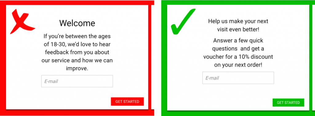
As a business, you might be trying to expand, and therefore you’ll want the input of other users that may not be your original target market. Define what kind of audience you want to attract and then cater your survey to suit their needs and requests. You may even want to offer an incentive to complete the survey.

For example:

6. Questions that trash your competition

Definitely a no-no – bad mouthing your competitors is something you don’t do. Why? Because it can hinder and bring damage to your own reputation. Being the bigger person gives a much better impression to leads or customers. When you speak negatively about the competition, you might appear to be jealous or fearful of them.

On top of that, you want your client to select you because they feel you best understand their situation and they see you as the best option.

Examples of survey design mistakes

1. Not defining the purpose of your survey

It’s easy to fall into the trap of just posting generic survey questions, the sort of questions you think that you should be asking and that people will want to answer. However, it’s beneficial first to give your survey a purpose and then create it from there.

Simply ask yourself what you’re using the survey for and what kind of result you want. You may be looking to improve your customer service, your website experience or do some market research on your products and services. However, don’t try and fit it all into one survey. This is actually a very common survey mistake, make sure you give your questionnaire just one purpose.

This means you need to edit your questions after you’ve created them to ensure that it fits this message. You can also use this opportunity to check other parts of your writing, such as grammar. For editing tips and tricks, you can use tools like Big Assignments. For information on grammar, check out State of Writing.

2. Forcing people to answer all the questions

You’ll need to remember that people are completing your surveys in their own time. The chances are that they’re not getting anything for it and they probably just don’t have anything better to be doing right then.

However, if you’re restricting progress in the survey because they need to answer all the questions, respondents will just abandon it. A few missed answers here, and there won’t harm your overall results, so let them be.

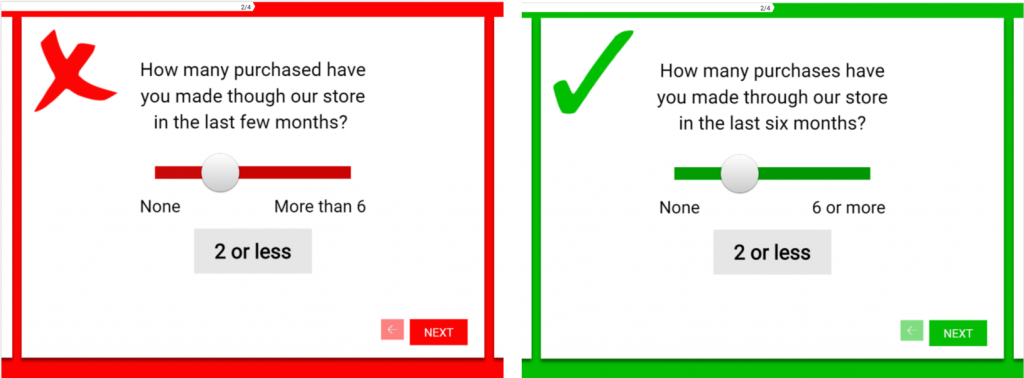
3. Not proof-reading your content

Just like the rest of the content your business uses, you need to make sure that your survey content is accurate and precise. If it’s full of mistakes, it will lose its credibility and most users will end up simply leaving it unfinished and you’ll have wasted time and money.

For example:


Instead, create your survey questions and work your way through it several times to make sure that it’s free from silly errors and mistakes. In fact, ask someone else to read it for you too!

You could also use a professional proofreading tool, such as Resumention, to guarantee accuracy. Apart from that, online survey-creation platforms help ensure that your survey is accurately made during development.

4. Only using open-ended questions

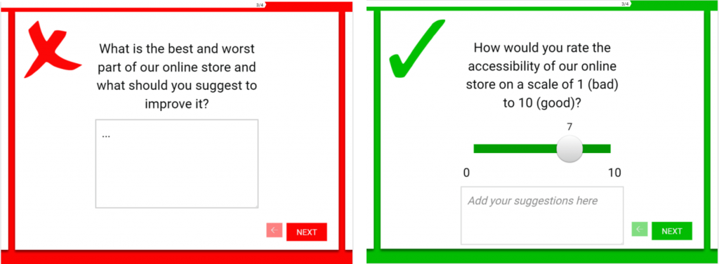
This may seem like an obvious survey mistake, but it’s important that you’re precise with your questions and don’t leave all of them open-ended. While it’s smart to include comment sections where people can have their say, in fact, it’s encouraged, your questions need to be easy to answer, straightforward and precise.

Adding too many open-ended questions to your survey will make the process of filling them out take longer, which might trigger respondents to abandon it too early.

For example:


Consider the context of your company and customers when you make your own survey: depending on your research goals, your question and respondent answer types and order might differ too. This doesn’t give you a reason to be boring though. With over 10 different types of survey questions, you’re guaranteed to find the format that suits you and your audience best…

5. Making your survey too long

This is by far one of the most important survey mistakes to look out for. Nobody wants to sit, read through and answer hundreds of questions spread out over dozens of pages. You’ll lose the commitment that your readers initially have, as well as their attention span.

This means your readers either won’t finish the survey or they’ll just give random answers just to get it over and done with. Try and keep it short, sweet and precise. Aim for ten questions. If you need more, maybe push it to 15, but that should be about it.

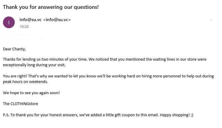
6. Not listening to the feedback you collect

The definition of feedback is: “Praise or criticism given in response to something you do”. Not listening to feedback is the same as not listening to your audience. And how can you grow if you’re not willing to listen and adjust to what your respondents need and expect from your surveys.

Tip: There’s a great opportunity to follow up with users after they’ve submitted their responses and let them know you’re listening. Tell them you’re changing A, B, C issues they’ve mentioned for example.


Focus on creating a better and more open line of communication with your respondents. That’s why feedback isn’t only important for you but for your respondent as well because they feel listened to. Not only that, it motivates them to take follow-up surveys if you plan on contacting them again.

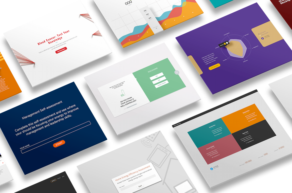
7. Not using interactive elements to keep it interesting

Why only use text questions when you have tons of different question types to add diversity to your surveys? Here at Pointerpro we have also a lot of fun gamification features, like the widgets to hand out Incentives. Take incentivizing to another level with a digital Scratch Card or Slot Machine. OR, maybe try adding a fun video or a few gifs to spruce up your survey.


Adding these type of elements and variations in your question sequence will help your respondents keep their head in the game and remain focused. Do you have a serious topic or difficult material? Add these types of questions and methods to make your survey more accessible and easier to get through.

Take our survey maker for a spin with a free trial if you want to experiment right away.

8. Not sharing your survey on all your available platforms

Why shouldn’t you? Next to the normal ways of sharing your surveys like embedded in an email or a cool button in your newsletter. Try all your social platforms as well, they all have their advantages and can be used for specific reasons.

Here are some key tips for sharing on social media platforms:

  • Write an engaging message for your social media post. The better the message, the more it will be shared. Short messages stand out — but long messages work if they’re compelling.
  • Add an incentive to increase your response rate. Make sure you check the local rules and regulations about online giveaways.
  • Try hashtag searches to identify relevant interest areas for targeting. It makes it easier for people to find your content
  • Choose the right time to post your survey. Keep the peek user moments in the back of your mind when posting.
  • Let your own network share your survey and increase your reach even more people.
  • Make sharing your survey easy. Add a share button to your survey and let your respondents do the rest.

Try going mobile with your survey, which is what the Pointerpro survey maker was made for in the first place! You could share your surveys via Whatsapp for example, or ask people to scan a QR-code or even let them type in a shortlink on their mobile devices. Add this big advantage to your sharing strategy and take over mobile!

9. Not using templates

Why make it more complicated for yourself? Use one of our pre-built survey templates to get yourself started. In our survey creator we have a dozen of easy to use templates that will make it easier for you to:

  • Be flexible
  • Be consistent and uniform
  • Speed up your creation time
  • Focus more on the questions itself
  • Reduce small technical errors

10. Not branding your content

Use your own branding as a way to stand out. This makes it easier for people to connect with you as a brand, it feels like they’re communicating with a brand they already know. It creates a feeling of trust and so you can make it fit with your other communication to lower the threshold of participating. In our tool, you can easily customize your surveys and questionnaires with just a click of a button. You can customize every question with different types of media, from images to videos and gifs. Easy peasy lemon squeezy.

reportr multiple purposes

11. Not using the right tools

The biggest advantage of a survey tool like Pointerpro is the ability to create a completely custom look and feel to create a unique and custom-developed survey.

By using the design features and interactive options in a smart way, you can create amazingly unique surveys that generate awesome engagement rates. So start from a simple form-based survey but create an amazing look and feel by using our (free) online survey maker and cool design features. Furthermore, integrating specialized tools such as digital experience management software can enhance your survey design process. These tools offer comprehensive solutions to ensure that your surveys align with user expectations and deliver an optimal digital experience.

Create your
own assessment
for free!

Create your
own assessment
for free!

About the author:
Gloria Kopp

Gloria Kopp

Gloria is a communication manager at Academized. She regularly shares professional advice in her posts at Microsoft and Revieweal blog.

3 Responses

  1. Really helpful tips Gloria. I will make sure to use them if I make a survey in the future, especially the one about using extremely complicated language. I’ve always had a hard time with expressing my questions in a simple manner.

  2. Happy to be here. I read lots of blogs about the writing services but honestly speaking I found your blog very interesting and informative.

  3. What an incredible work! Not only was it informative but also nicely written. To the point. Would like to read more from this space. Hope you will keep on offering good content like this more often.

Want to know more?
Subscribe to our newsletter and get hand-picked articles directly to your inbox