It’s well-established that quizzes and assessments are key tools for lead generation. A CMI study in 2017 already indicated that 79% of marketers were planning to use more interactive content including quizzes and assessments. 2023 online form statistics show that 74% of companies use web forms for lead generation.
About half of them confirm forms are also their highest converting lead generation tool.
“How can that be, when my online quiz is barely converting at all? Why don’t people like my quiz?”, I hear you thinking. Well, chances are, your quiz is just fine.
But what’s your quiz landing page like?
What is the purpose of quiz landing pages?
As you may know, a landing page is a web page focused on one specific objective. Generally to encourage visitors to take a specific action. This is an example of a Pointerpro landing page. The action we hope visitors take there, is to book a demo for our assessment and report software platform.
Since you’re reading this article, probably the action you want visitors of your webpage to take is… taking your quiz. So the central purpose of that landing page is to motivate and activate the visitor to do so. But what makes a quiz landing page great? A helpful way to figure that out is looking at various quiz landing page examples. So let’s.
Oh, and by the way, if you make it to the end, we have inserted a messaging template for the introduction of your own quiz or assessment. Or you can just skip to it straight away, of course.
The ultimate checklist for a captivating quiz landing page
Our goal is not to beat you silly with one random example after another. We’ll rate each example based on a quiz landing page criteria checklist:
- Attraction: Does it have a compelling headline?
- “What’s in it for me?”: Does it give a clear explanation about what the respondent gets in return for completing the quiz? For example: their score, multiple scores, advice on how to improve, possibility to see correct answers and/or benchmarks, etc…?
- “What do I have to do?”: Does it clearly indicate what the visitor has to invest: time, amount of questions, submit personal information such as name and/or email?
- Design: Does it offer visuals or design elements that attract the attention of the visitor? the visuals can be a ‘teaser preview’ from what the user will get at the end?
- Call-to-action: Does it have a strong call-to-action (tell them what you want, don’t dilly dally)? Does the CTA appear above the fold, so users don’t have to scroll down?
- Social proof: Does it have trust elements like the amount of social shares or quotes
- Personalization: Does it have a personal touch?
15 examples of great (and not so great) quiz landing pages
Note: we’ve constituted this list independently of whether the quizzes were created with our own quiz maker tool.
Quiz example 1: Sitecore
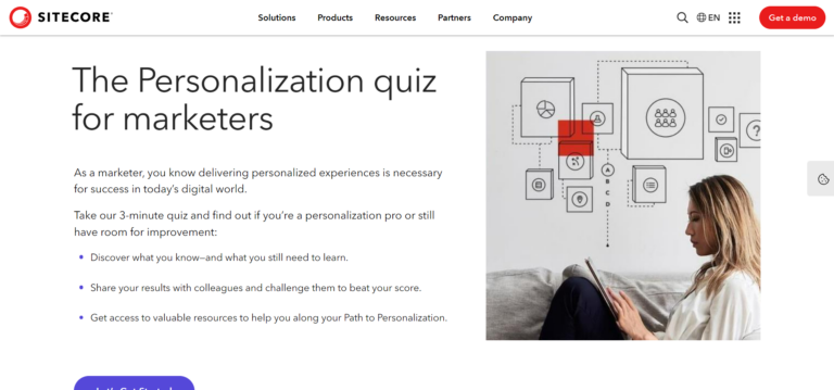
Company: Sitecore is the global leader in experience management software that combines content management, commerce, and customer insights.
Quiz landing page: The Personalization quiz for marketers lets you find out if you are a marketing personalization expert or still have room for improvement.
Rating: ⭐️⭐️⭐️
Strengths & weaknesses:
🟢 “What do I have to do?”: The visitor knows what he can expect of this quiz, and how much time he has to invest taking it.
🟢 “What’s in it for me?”: There are 3 clear bullet points that explain concisely what the advantages for the quiz are.
🟠 Call-to-action: There’s no distraction at all from any CTAs or the visual at the right side of the page. It’s a clean and neat quiz landing page. On some computer screens the button appears just below the fold however.
Quiz example 2: Persona Nutrition
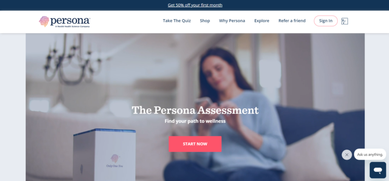
Company: Persona delivers the simplicity and convenience of a nutritional supplements program – personalized for customers by their experts and their cutting-edge technology.
Quiz landing page: The Persona Vitamin assessment creates a personalized vitamin pack program.
Rating: ⭐️⭐️⭐️⭐️⭐️
Strengths & weaknesses:
🟢 Social proof: The first thing that catches one’s eye are the reviews. These trust elements are essential for prompting visitors to take the assessment.
🟢 Call-to-action: There’s a very concise, yet promising call-to-action, followed by a button. Both are placed well above-the fold. A CTA-button is also repeated when you scroll down the page and this one reassures the visitor that taking the assessment itself is for free..
🟢 “What’s in it for me?” / “What do I have to do?”: The landing page does an excellent job laying out how the process works and what you will receive.
🟢 Personalization: It’s not necessarily linked to the assessment, but there is a chat functionality that connects you to a real team member in case you have questions. It just makes the whole feel very reliable.
Quiz example 3: Better Love

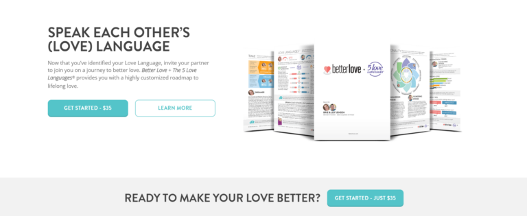
Company: Better Love is a company founded by a husband-and-wife team who not only share the same name, but the same passion for helping others build healthy relationships.
Quiz landing page: The Better Love assessment lets you discover many aspects of your relationship with a personalized love action plan.
Rating: ⭐️⭐️⭐️⭐️
Strengths & weaknesses:
🟢 Attraction: The headline on to the Better Love’s webpage, which is also the homepage, gives a compelling promise, written in the active sense, followed by a subtle arrow down. It makes you want to find out more.
🟢 Design: The background video is aspirational and reinforces the headline’s promise. The entire page is designed very nicely with just enough animations and icons to make it attractive.
🟢 “What’s in it for me?”: As you scroll down, there’s a clear explanation of what you’ll get out of taking the assessment: a roadmap for you and your partner to lifelong love.
🟢 “What do I have to do?” As you scroll down the page everything is clearly explained: how the assessment works and how you get started.
🟠 Social proof: Yes and no. There are definitely quotes that seem like user testimonials, but in the end it’s not so clear that they are because they don’t speak about personal experience with the assessment.
🟠 Call-to-action: You don’t find out that Better Love is actually offering an assessment to fulfill the promise given above the fold, until you scroll down below the fold and stumble on CTA-buttons.
Quiz example 4: Axway
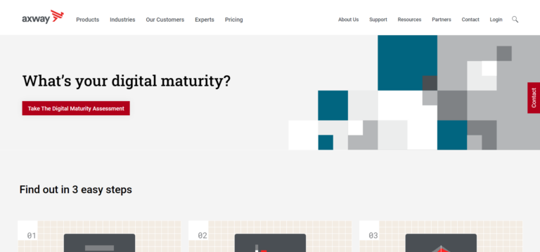
Company: Axway enables customers to succeed using hybrid integration to connect people, systems, partners and ecosystems.
Quiz landing page: The Digital Maturity assessment measures your current digital maturity and compares it to your peers.
Rating: ⭐️⭐️⭐️⭐️
Strengths & weaknesses:
🟢 Attraction / Call-to-action: This landing page excels in straightforwardness. The headline is a question you realize you probably can’t answer. The next thing you read is the call-to-action that implies you will be able to answer the question, once you take the action: Taking the digital maturity assessment.
🟢 “What do I have to do?”: The 3 steps are clearly laid out just below the fold. Notice the title of that section (“Find out in 3 steps”) finds itself above-the fold, inciting you to scroll down.
🟢 “What’s in it for me?”: The very next thing in 3 simple steps, just below is “why you should take the digital maturity assessment.
🟢 Design: The page has a modern and minimalistic design. It really suits the subject matter.
🟠 Social proof: There are no testimonials or quotes about the assessment. The website footer does mention Axway’s Microsoft Gold Partner status and AWS Technology Partner status. Those do count as trust elements.
Quiz example 5: Henry Schein (Demandforce)
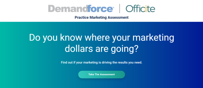
Company: Henry Schein is a solutions company for healthcare professionals powered by a network of people and technology.
Quiz landing page: The Practice Marketing assessment lets you find out if your marketing is giving you the results you need.
Rating: ⭐️⭐️⭐️
Strengths & weaknesses:
🟢 Design: Clutter smothers, simplicity breathes. The page is minimalistic, making it easier for the visitor to concentrate on the message of the assessment.
🟢 Attraction: The page stirs the interest of the visitor by asking intriguing questions you don’t feel comfortable knowing the answer to and so the page exposes a potential problem. One major flag to note: One of the headlines refers to 2021. That makes everything feel dated and less trustworthy. In principle, the attraction factor of the page is green. But because of this no-no, it actually should have been orange, or even red.
🟢 Call-to-action: The call-to-action and button to start the assessment follow the intriguing headline immediately, and thus offers a solution to the problem the headline just established.
🔴 “What’s in it for me?”/ “What do I have to do?: Unfortunately, there is no information about these two aspects, besides the call-to-action mentioning you’ll find out if your marketing is driving the results you need.
Quiz example 6: Center for Digital Education
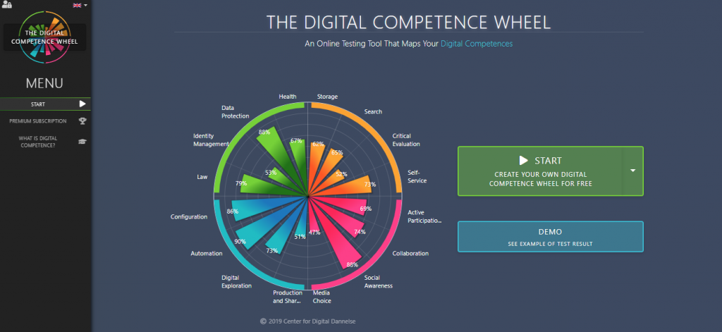
Company: The Digital Competence Wheel was developed by the Center for Digital Education, which has been engaged in digital competencies and digital education since 2009.
Quiz landing page: The Digital Competence Wheel provides you with an overview of your digital competences and which ones should be improved.
Rating: ⭐️⭐️⭐️⭐️⭐️
Strengths & weaknesses:
🟢 Design: Absolutely stunning. The first thing that grabs the visitor’s attention is the interactive circular chart. It immediately makes it very clear what the user gets in return, right after the assessment. The page is designed so powerfully, that pretty much anything else lacking is not a real problem.
🟢 “What’s in it for me?”: In case the visual isn’t enough to seduce a visitor, he or she is given a lot of other reasons just below the fold to consider the assessment.
🟢 Call-to-action: The CTA is right next to the digital competence wheel. And it gets even better. The visitor gets more than just the visual digital competence wheel. He’ll get a tailored recommendation, a lot of examples of different aspects of digital competence and lots of exercises and motivational examples. The information is so well put together on the landing page, that it leaves no surprises for the respondent while taking the assessment.
🟠 “What do I have to do?”: The page advertises the quality of the assessment so strongly, that you may expect the assessment to be quite complicated to take. Unfortunately the page offers no reassurance on that point.
Quiz example 7: Adobe
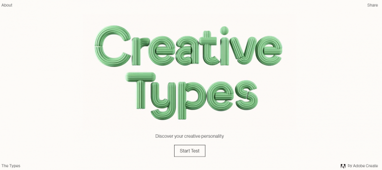
Company: Adobe is the global leader in digital media and digital marketing solutions. Their creative marketing and document solutions empower everyone – from emerging artists to global brands – to bring digital creations to life and deliver immersive, compelling experiences to the right person at the right moment for the best results.
Quiz landing page: The Creative Types assessment lets you discover your creative personality.
Rating: ⭐️⭐️⭐️⭐️
Strengths & weaknesses:
🟢 Design: Unsurprisingly, Adobe did an exquisite job designing this landing page. It fits the brand and its style for sure. A very minimalistic approach with great design and animations. The kind of assessment is clear as well, namely: a personality test.
🟢 Attraction / Call-to-action: Although written in a small font, the call-to-action is clear and in harmony with the luxuriously present page title.
🟠 “What’s in it for me?”: As a visitor you probably form some sort of idea about what you’ll get out of taking the quiz, but there are no details. In many cases this could cause visitors ro abstain from participating but thanks to the strong Adobe brand, it surely doesn’t here.
🟠 “What do I have to do?”: The same goes for this criterion. it would have made the landing page better if the amount of questions were mentioned. A good tagline could’ve been “Discover your creative personality in just 15 questions!”
Create your
very own quiz or assessment with Pointerpro.
Quiz example 8: Conversion
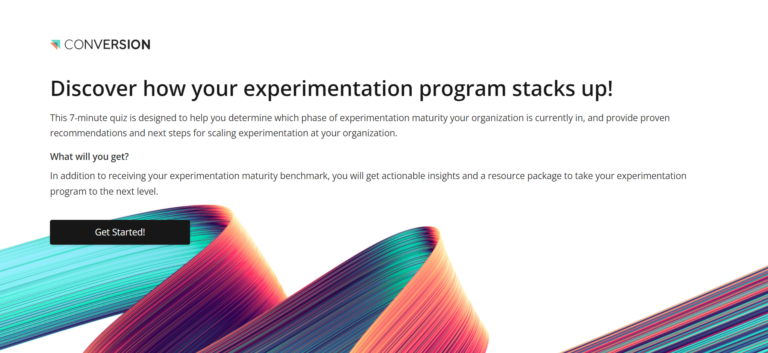
Company: Conversion is a leading optimization and experimentation company. They partner with change-makers in growing organizations to launch, accelerate, and scale their experimentation programs.
Quiz landing page: The experimentation maturity quiz helps you to determine which phase of experimentation maturity your organization is currently in and gives you recommendations for scaling experimentation.
Rating: ⭐️⭐️⭐️⭐️
Strengths & weaknesses:
🟢 “What’s in it for me?”: It says what the respondent can expect in return after taking the quiz. And that is not only their maturity benchmark, but also insights and a resource package as well.
🟢 Call-to-action: The CTA consists of the headline and the button. Everything is placed above the fold and there’s no clutter.
🟢 Design: Visually the landing page is very minimalistic but modern. It goes along well with the subject matter.
🟠 “What do I have to do?”: The landing page indicates it takes only 7 minutes of your time. It doesn’t go into what the number or types of questions you’ll get, though. However, that probably won’t stop anybody from taking the quiz.
Quiz example 9: INSIGHT2PROFIT
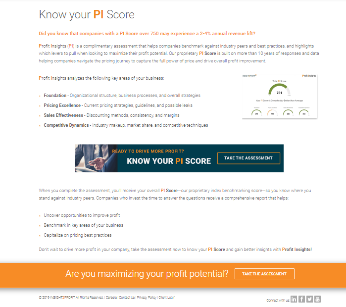
Company: INSIGHT2PROFIT is a market-leading technology-enabled service company focused on delivering sustainable revenue and EBITDA growth through the implementation and management of pricing and profit strategies.
Quiz landing page: The PI Score assessment helps your organization benchmark against industry peers and highlights which levers to pull when looking to maximize your organization’s profit potential.
Rating: ⭐️⭐️⭐️
Strengths & weaknesses:
🟢 “What do I have to do?” Easily and often overlooked by on assessment or quiz landing pages, but not by INSIGHT2PROFIT: They start with a brief explanation of what their PI score is about exactly.
🟢 “What’s in it for me?” They go on with explaining what the respondent gets in return right after the assessment. And that is: once the respondent receives their PI score or INSIGHTS PROFITs index benchmarking score, they’ll be able to know where they stand against industry peers.
🟠 Call-to-action / Design: You can’t tell from the screenshot above but the CTA is actually placed their under the fold. Because the start of the page is very textual as well, a visitor might overlook it’s actually possible to start the quiz from this page.
Example 10: Airbnb
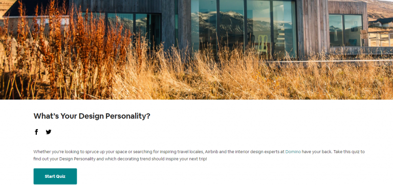
Company: Airbnb is a community marketplace for people to list, discover, and book unique accommodations around the world — online or from a mobile phone.
Quiz landing page: The Design Personality quiz lets you find out what kind of design personality you have and which decorating trend should inspire your next trip!
Rating: ⭐️⭐️
Strengths & weaknesses:
🟢 Design: Visually the page inspires with the strongly present photo and the minimalistic design, although there are some other issues we go into below.
🟠 Attraction: The entire above-the-fold consists of an image (the screenshot you see is already scrolled down below the fold). There’s literally no message. A big no-no. The first thing below the fold is a headline question.
🟠 “What do I have to do?”: Even below the fold there’s no information about what exactly is expected from you, or how much time you’ll have to reserve for the quiz. Interestingly, this information does show up once you’ve clicked on “start quiz.” But that actually defeats the purpose of having a quiz landing page.
🟠 Social proof: The page does mention in conjunction with whom the test was created: Design Experts at an agency called Domino. That does qualify as a trust element, but it isn’t social proof the quiz is actually valuable.
Quiz example 11: LanguageSolutions
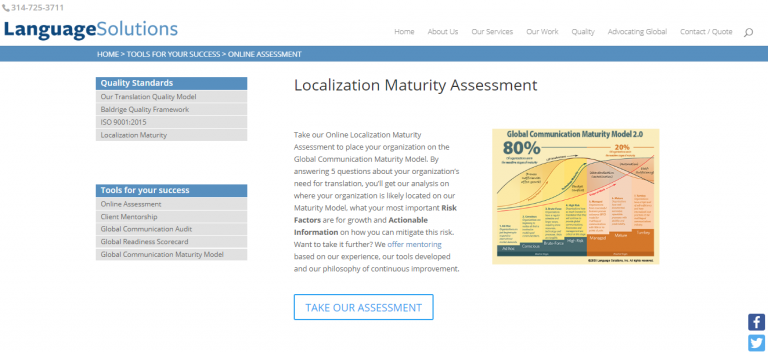
Company: LanguageSolutions enables their customers to be able to communicate effectively and ensure understanding in other languages as well as with limited literacy populations.
Quiz landing page: The Localization Maturity assessment gives you an analysis on where your organization is likely located on their Maturity Model, what your risk factors are for growth and actionable information on how you can mitigate those risks.
Rating: ⭐️⭐️⭐️
Strengths & weaknesses:
🟢 “What’s in it for me?”: LanguageSolutions’ landing page explains the outcomes beforehand. A very clear explanation about what the respondent can get in return, namely in which stage is their organization placed.
🟢 “What do I have to do?”: LanguageSolutions clearly indicates what the visitor has to invest, and that’s the number of questions.
🟢 Design: Even though the page is simple and looks somewhat outdated, there is a visual that supports the assessment methodology. Unfortunately, the resolution isn’t very high. In principle it deserves some kudos.
🟠 Attraction / Call-to-action: There is no headline. The CTA button does attract the visitor and is located above the fold. Then again, the text above contains another call-to-action, about LanguageSolutions services. Not quite what it should be.
Create your
very own quiz or assessment with Pointerpro.
Quiz example 12: Website Silk
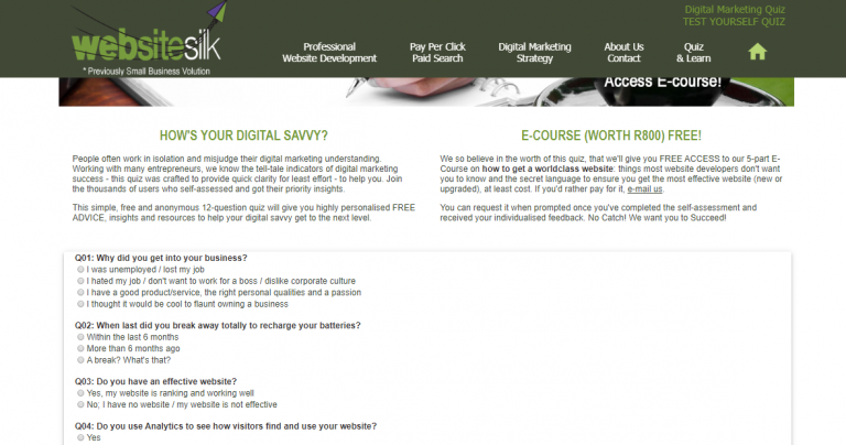
Company: Website Silk specialises in Custom Website Development for the fastest, mobile-friendly, well-ranked websites.
Quiz landing page: The Digital Savvy quiz provides you highly personalized free advice, insights and resources to help your digital savvy to get to the next level.
Rating: ⭐️⭐️
Strengths & weaknesses:
🟢 Attraction: The headline is located above the fold (not visible on the screenshot) and attracts because it mentions that the assessment is for free. That said, it doesn’t clarify much else.
🔴 Design / Call-to-action: There’s a call to action for the quiz on the left, and an e-course on the right. It’s quite confusing. Overall the page simply has a very outdated design. As you scroll down, you notice the quiz questions are actually present on the page.
Quiz example 13: LeadershipIQ
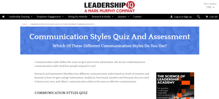
Company: LeadershipIQ
Quiz landing page: The Leadership IQ quiz is a communication styles assessment to help you figure out which one out of four different communication styles you have. After taking the 12-question quiz you can leave behind your contact information to receive a breakdown. That can help you become a more effective communicator.
Rating: ⭐️
Strengths & weaknesses:
🟢 “What’s in it for me?”: You really have to read into the text but you do get a real understanding of why it would be useful and interesting to know what communication style you have.
🟠 Attraction: There’s a missed opportunity here. The headline is very present, but it merely asks the visitor “which of the different communication styles they use”. The headline doesn’t make you feel like it really matters. It lacks the iconic “why?”. An alternative would have been something along the lines of “Understand your communication style to become an effective communicator.”
🔴 Design / Call-to-action: The quiz landing page scores pretty poorly on these two. First of all the landing page is highly textual (it’s actually a blog article!). And then also the call-to-action and button only appear after you scroll down.
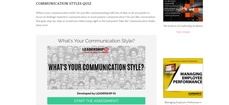
Quiz example 14: Gyfted
Company: Gyfted is a recruitment expert that offers tools for job seekers and companies. They have several assessments for job seekers that are free. The most important advantage for them is most likely that with the data coming out of those, they can create better matches between candidates and companies.
Quiz landing page: One of the assessments is a communication style test. A good opportunity to see how it contrasts with the landing page of LeadershipIQ we just discussed.
Rating: ⭐️⭐️⭐️
Strengths & weaknesses:
🟢 “What’s in it for me?”: Both the text and visual above-the-fold give the visitor a clear indication of what you get out of it. Lower on the page there is some clear and well structured information in addition.
🟢 Call-to-action: Simple but effective. A very clear button that follows a brief explanation inciting you to discover your communication style for free.
🟠 “What do I have to do?”: Even though there’s a visually clear “How it works” section lower on the page, the information in that section actually doesn’t really tell you anything about how long it will take or how many questions you’ll need to answer.
🟠 Design: Overall, the page breathes well. It’s clear, concise and doesn’t overload you with information. Definitely a positive thing. The visual above-the-fold technically clarifies what you’ll get out of taking the test, as mentioned. However, the actual image size and quality are not what it should be. It’s too difficult to read. The result? You probably don’t.
🟠 Social proof: There aren’t any testimonials or quotes from users, but the reference to various universities that Gyfted collaborated with to make its assessments is a trust element.
Quiz example 15: Management Training Specialists
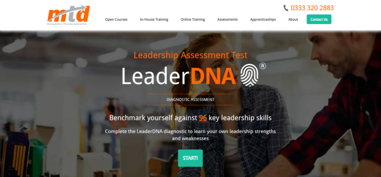
Company: Management Training Specialists (MTD) is a management training consultancy active in over 25 countries.
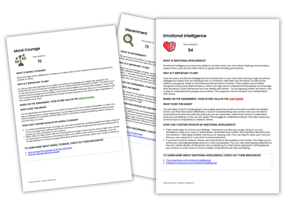
Quiz landing page: The Leader DNA diagnostic assessment is an assessment that leads to a 25 page report about various leadership skill areas.
Rating: ⭐️⭐️⭐️⭐️⭐️
Strengths & weaknesses:
🟢 Attraction / Call-to-action: The name and logo attract the eye as you open the page. The fact that MTD branded their assessment this way, immediately gives it a professional and trustworthy feel. Even though the headline is rather small, it is located above-the-fold and constitutes a convincing call-to-action: “Benchmark yourself against 96 key leadership skills.” The term benchmark is very compelling because it implies you’ll be assessed in comparison with other managers/leaders. Also there’s a button to start the quiz, that stands out clearly. Lower on the page three more CTA buttons appear and even stand out, without distracting you from absorbing the information.
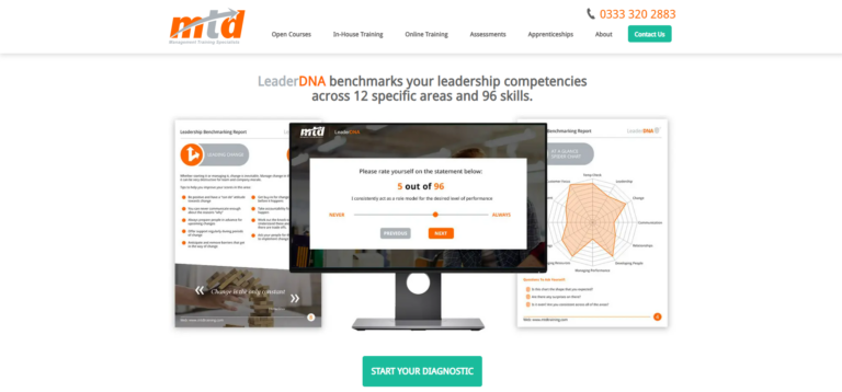
🟢 “What’s in it for me?” / “What do I have to do?” / Design: As you scroll down the page, MTD clearly and concisely explains what you get out of the assessment (a report), how many questions you need to answer, and how much time it should take. On top of that, it does so with strong visual support. The bottom of the page is dedicated to frequently asked questions, which also useful for someone who really wants all the details.
🟠 Social proof: Everything else on the page is so professionally managed, that you almost forget to notice there are no testimonials or elements to confirm the assessment is actually worthwhile.
The perfect template for the introduction of your quiz or assessment
1. Assessment
Let’s say you’re making an assessment and don’t know what message to put on your landing page. Here are some good examples that you can use:
Discover your ____ in just ___ questions and get awesome insights on how to improve___. Example: Discover your top career matches in just 15 questions and get awesome insights on how to improve your happiness in the workplace. |
Take our ___ minute ___ assessment to find out how successful your ___ currently are. Example: Take our 5 minute Digital Marketing assessment to find out how successful your Digital Marketing efforts currently are. |
Do you have what it takes to be ___? Find out by taking our ___ questions assessment and see how your personality compares to the profile of today’s ___. Example: Do you have what it takes to be a leader? Find out by taking our 13-question assessment and see how your personality compares to the profile of today’s successful leaders. |
2. Quiz
Imagine you’re making a quiz where you want to test people’s knowledge. A good example would be to tell your target audience what they can expect:
Test your ___ with our ___ minute quiz, and see if you would act appropriately in these ____ situations. Example: Test your business etiquette skills with our 7 minute quiz, and see if you would act appropriately in these 14 business situations. |
You think you know ___? Test your ___ with our quiz in just ___ questions and get actionable advice and insights on how to improve your ___. Example: You think you know business? Test your Entrepreneurial I.Q with our quiz in just 15 questions and get actionable advice and insights on how to improve your entrepreneurial potential. |
Rate your___ knowledge in ___ minutes and get industry benchmarks with an overview on how you compare to others. Example: Rate your Content Marketing knowledge in 3 minutes and get industry benchmarks with an overview on how you compare to others. |
No purpose in having a great quiz landing page without a quality quiz
We said earlier that landing pages encourage visitors to take a specific action. And to encourage them towards your objective – your quiz landing page has to be on point. That also means it has to be in harmony with your quiz or quiz or assessment.
If you create a high quality quiz or assessment, your landing page needs to evoke that. Good luck!


5 Responses
Nice article! it really helped me a lot!
Very insightful, thank you, just what I’ve been looking for!
Wow, I am impressed. thank you.
Your writings will definitely help me tremendously.
You do have a lot of potentials.
Ever thought you could easily create some training or course for developing a quiz marketing agency?
Thank you.
this is a great article, with a lot of useful information, and well explained it was wonderful to read, thanks
Very helpful! You’re one talented writer, for sure 🙂